quiet power, defined clearly
branding and eCommerce for timeless luxury
elegance with intent
Rinessa was built to feel timeless, not trend-driven. The brand moves with control, speaks with precision, and presents itself through design that respects attention. Every layer reflects structure, discipline, and confidence.
we defined rinessa’s positioning, narrative, and voice. the outcome is a brand that sounds composed and speaks with purpose.
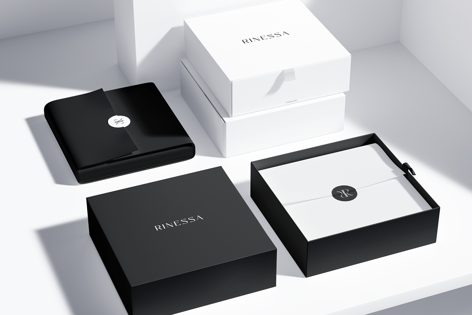
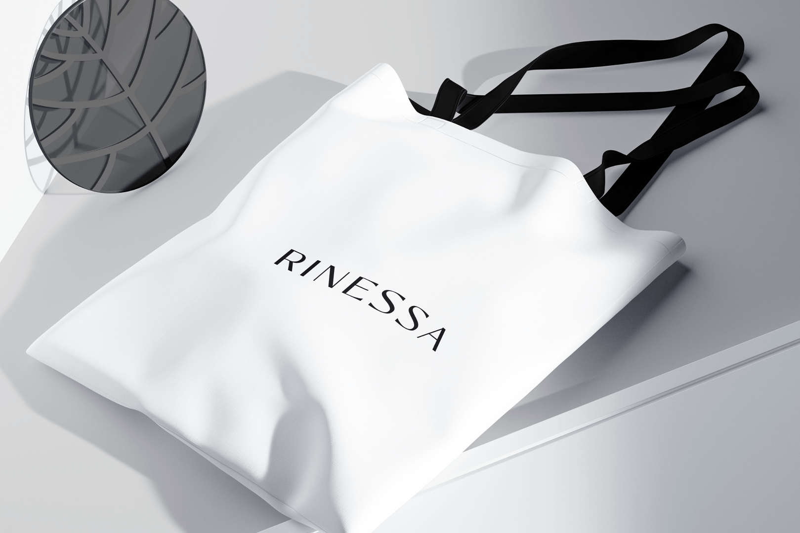
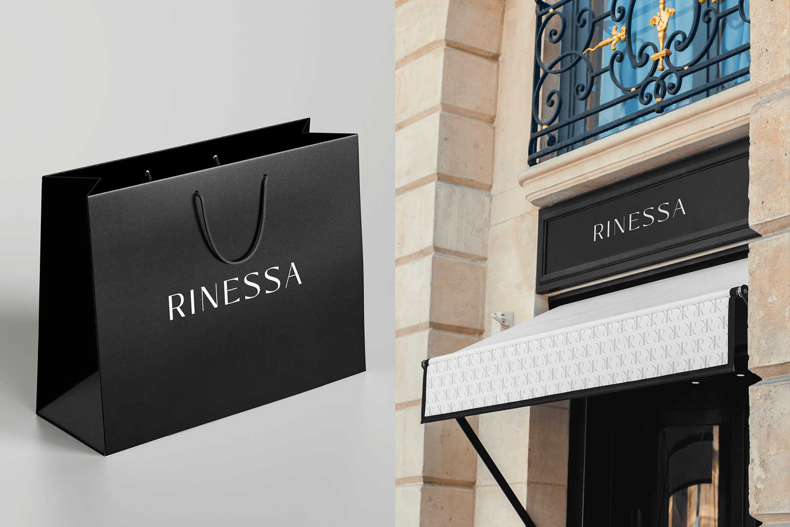
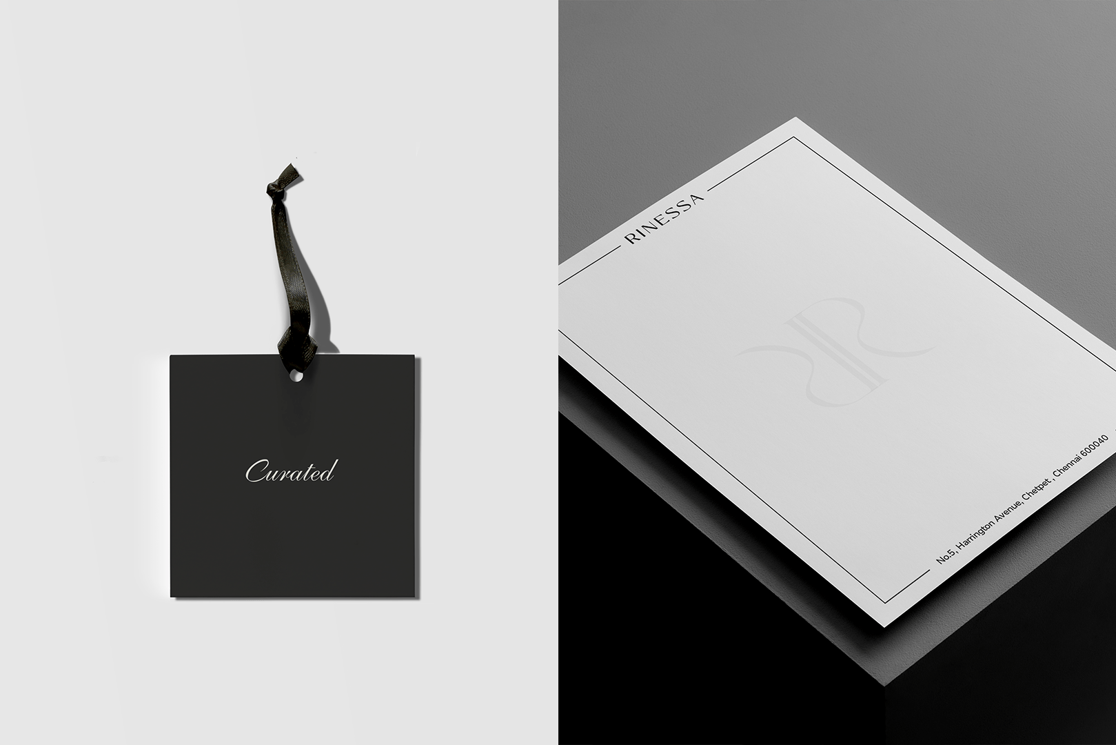
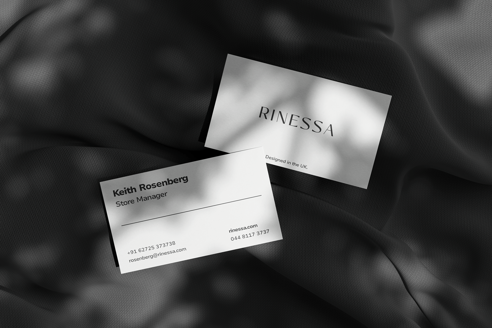
visual identity system
we designed the logo, monogram, typography, and layout rules. each decision was made to reflect clarity, restraint, and quiet strength.
ecommerce platform build
we developed a custom digital storefront that mirrors the brand’s values. the interface is focused, intuitive, and built to support premium shopping experiences.
Brand Strategy & Identity
01 Problem
Most ethnic fashion brands fall into two traps. They either lean too hard on heritage or try too hard to appear modern.
Rinessa needed to feel timeless without being predictable. It had to carry elegance, exclusivity, and global relevance without sacrificing cultural roots.
02 Approach
We built the brand around balance. The tone, layout, and structure were crafted to reflect quiet confidence. Every choice, from typography to language, was designed to feel refined and intentional. Nothing was added unless it served the core idea of elegance with restraint.
03 Solution
We delivered a complete brand and eCommerce experience. The identity system is minimal but memorable. The digital store mirrors the personality of the brand, clean, polished, and made for a discerning audience. Every element, visual and verbal, contributes to a consistent story of modern luxury.
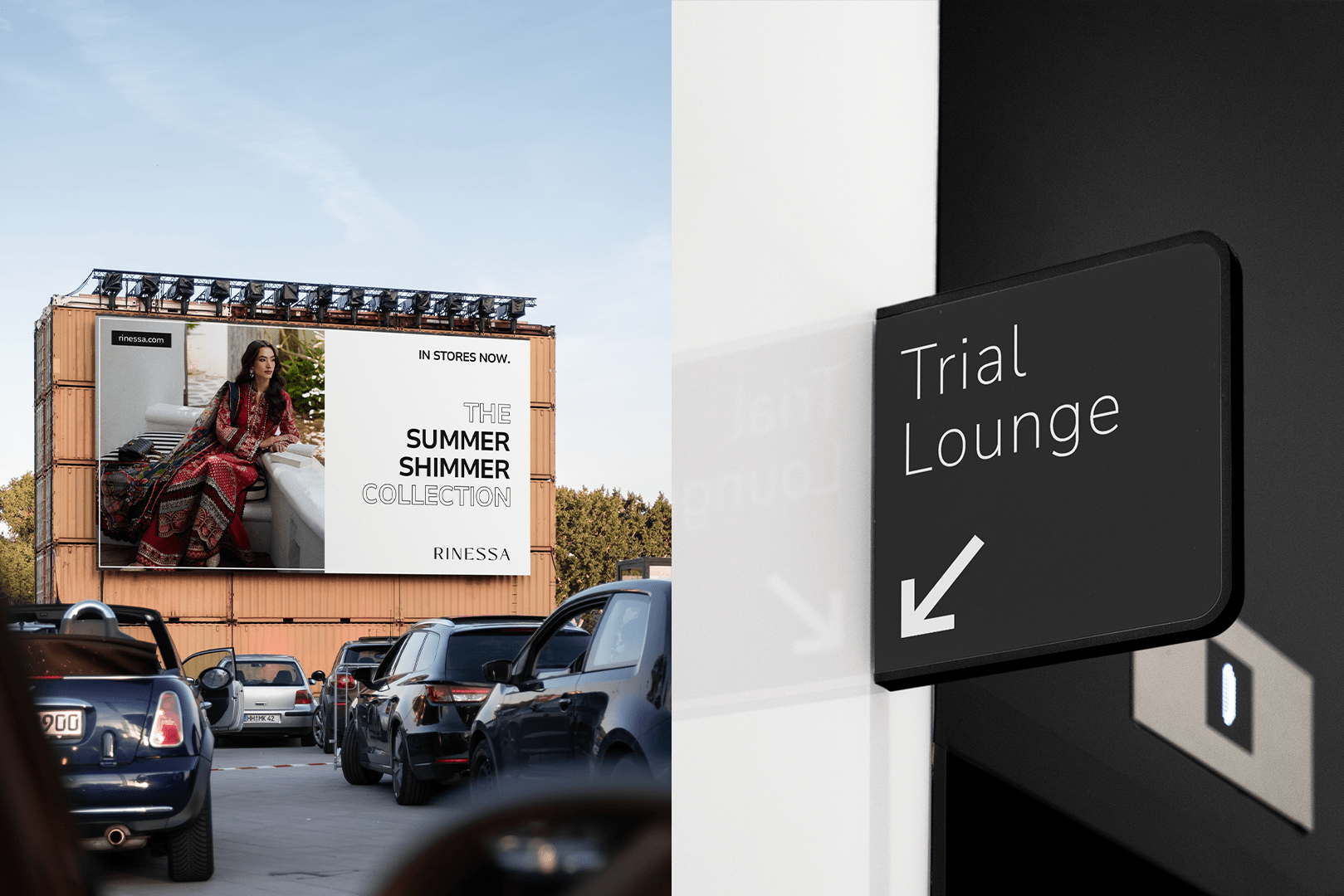
visual presence
The logo is grounded. It does not chase attention. The monogram is reserved for curated placements. Typography and layout use rhythm and contrast to create calm. The entire palette supports stillness and structure.
brand detailing
From alignment rules to negative space, the system follows strict discipline. Layouts are built on structure, not improvisation. Every visual rule is made to preserve clarity and protect the brand’s tone across all environments.
brand language
The copy respects intelligence. It avoids trends and avoids urgency. Every line is written to feel precise and timeless. The voice does not need to sell. It needs to stay.
this is how elegance holds
Rinessa proves that a brand can speak softly and still lead. We did not decorate the brand. We defined its presence.
Every visual, every word, every rule serves the same purpose — to reflect clarity, balance, and timeless confidence.
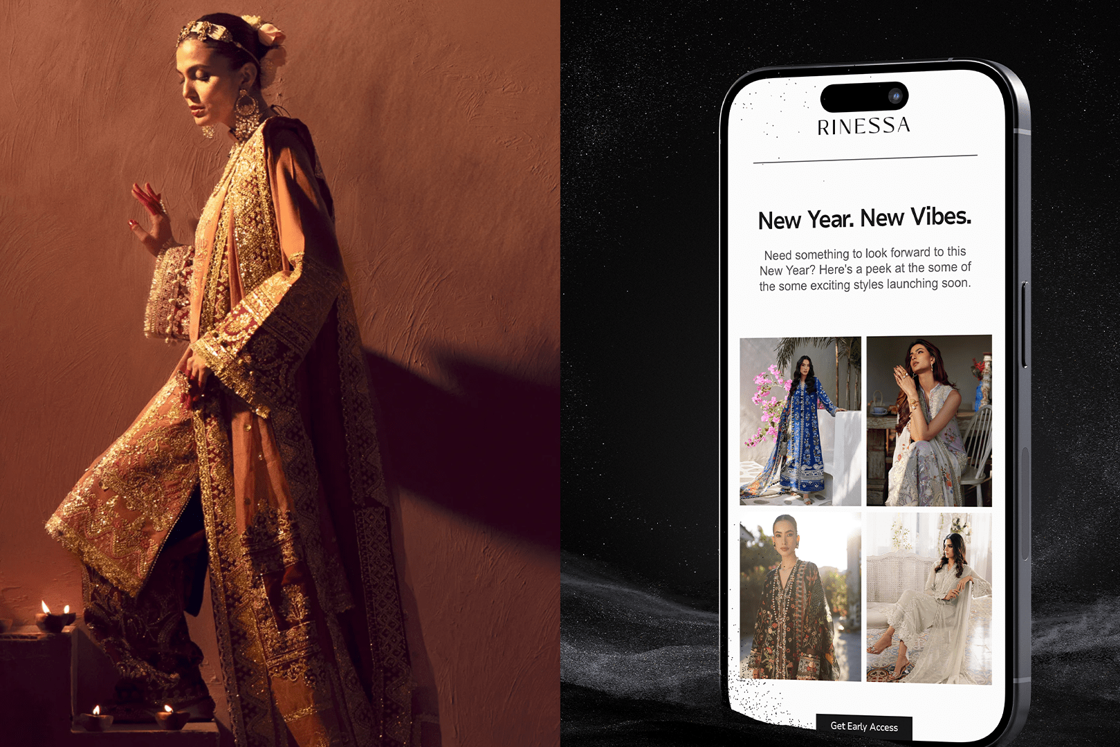
digital flagship experience
e-commerce with clarity
Rinessa's website was designed to reflect the brand’s standards of clean layouts, sharp structure, and thoughtful pacing. From product discovery to checkout, the journey is smooth, quiet, and built to serve a discerning audience. No distractions. Just focus on what matters.
Navigation is clear, with a structure that respects time and attention.
Product pages are focused, with no distractions from imagery or detail.
Filtering and sorting are frictionless, designed to guide without noise.
The cart and checkout flow is clean, built to reduce drop-off at every stage.
Every interaction is intentional, reinforcing trust and control throughout the journey.
Let’s collaborate.
Work with us to create solutions that drive real results for your business.