food, feelings, feedback
branding, design, and installs built from intent
product to performance
Chewy was built to make food tracking feel useful, not mechanical. The product teaches you through action, the brand speaks with intention, and the entire system — from visuals to voice — works toward long-term growth with zero confusion.
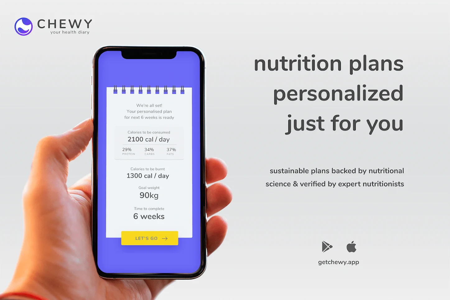
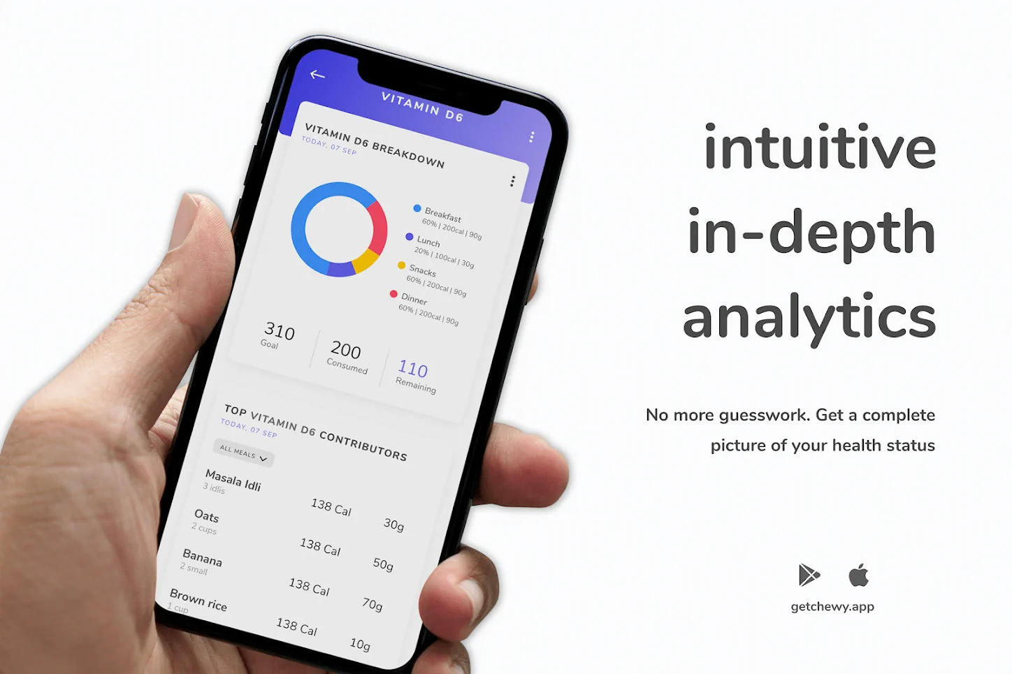
we designed an experience where every tap creates clarity. the interface is built to be fast, calming, and friction-free. every screen helps the user understand their food and feel in control of their choices.
content and social system
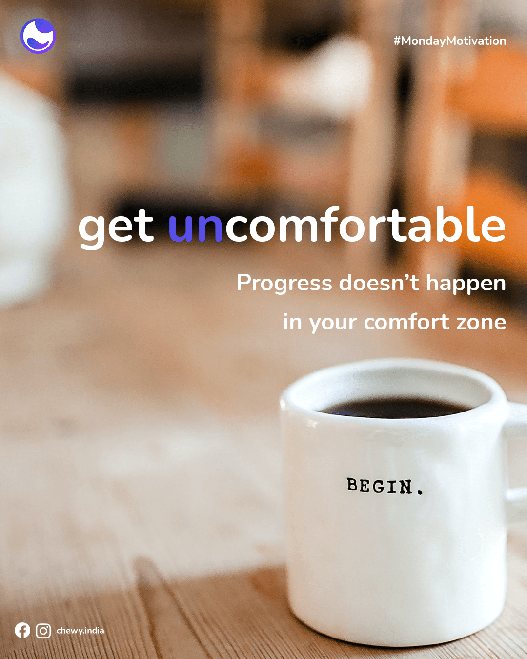
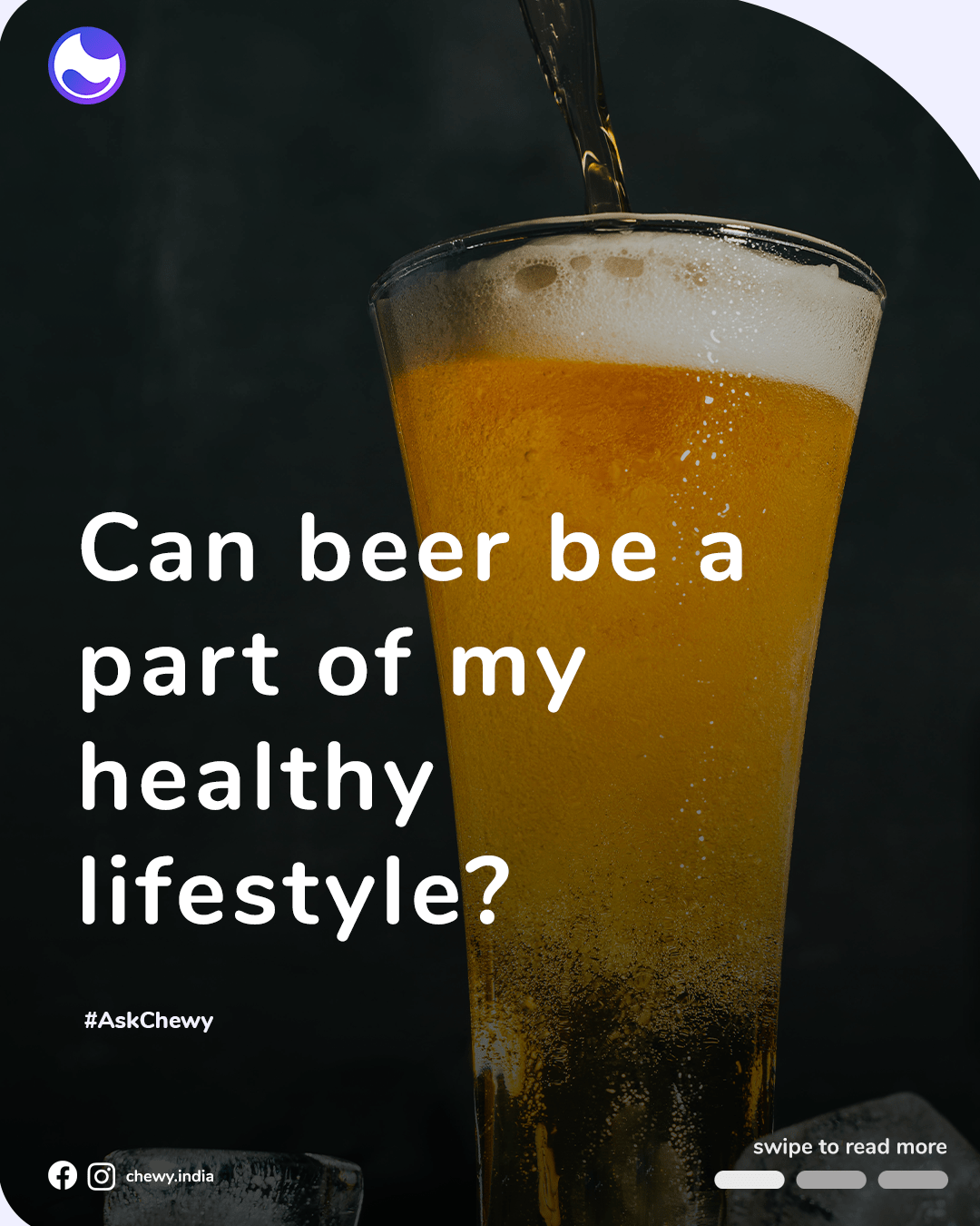
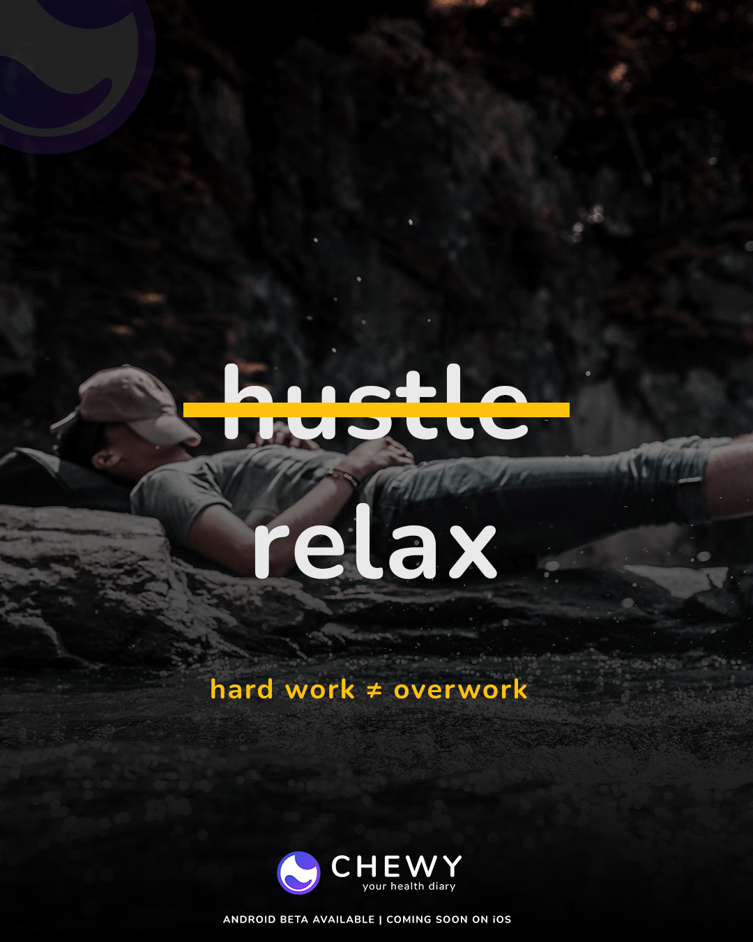
we built chewy’s social layer to educate, not entertain. every post serves the product. carousels teach features, reels explain logic, and stories convert curiosity into installs.
performance marketing strategy
we launched campaigns that mirrored the app. ads looked like the product, spoke like the product, and led users into features they already understood.
product growth and more
01 Problem
Most app campaigns optimize for installs, not intent. They chase volume and end up with drop-off.
For Chewy, we needed more than installs. We needed awareness, belief, and day-two usage.
The challenge: how do you get people to install a health diary and actually use it?
02 Approach
We reversed the funnel. Instead of pitching features, we designed creative that mirrored in-app behavior.
Each ad was a preview of value, not a highlight reel.
The messaging was focused, the targeting was contextual, and the spend was optimized for retention and not just reach.
Social channels were treated as onboarding, not promotion.
03 Solution
We delivered a campaign ecosystem, not just ad sets.
Performance ads, content hooks, and CTA paths were built from the product outward.
Creative was structured around use cases, blockers, and real-world curiosity.
The result: a growing install base that understood the product before even downloading it, and stuck with it after they did.
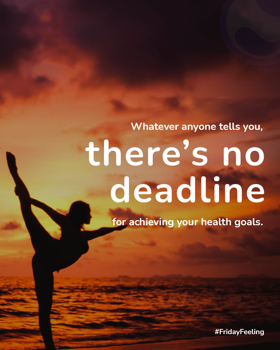
content that converts every swipe moves closer to install
Social wasn’t built for likes. It was built to create momentum. Every post had a clear purpose. Some explained the product. Others tackled user hesitation or highlighted a single feature. The goal was to deliver value in every swipe. Design stayed consistent with the app. Language stayed sharp and useful. No noise. No trend-chasing. Just clarity.
Each format worked like a functional block. Carousels taught. Reels showed. Stories guided. The grid acted as public onboarding, not brand wallpaper. Users learned something before they even downloaded the app. Every scroll brought them closer to understanding and action.
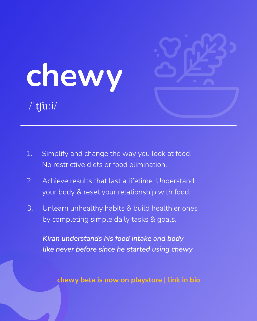
clarity through food
Most wellness tools focus on willpower, guilt, or tracking. Chewy does none of that.
It asks better questions:
Why do you eat what you eat?
How does it make you feel?
What patterns are forming that you don’t notice yet?
We didn’t build a product around goals.
We built one around awareness.
built for consistency
From alignment rules to negative space, the system follows strict discipline. Layouts are built on structure, not improvisation. Every visual rule is made to preserve clarity and protect the brand’s tone across all environments.
Ads that didn’t feel like ads.
Performance marketing was built inside out.
We didn’t start with platforms. We started with in-app moments.
Then we mapped those moments to audience behavior.
The result:
High install volume. Low uninstall rate.
Engaged users who remembered what they came for.
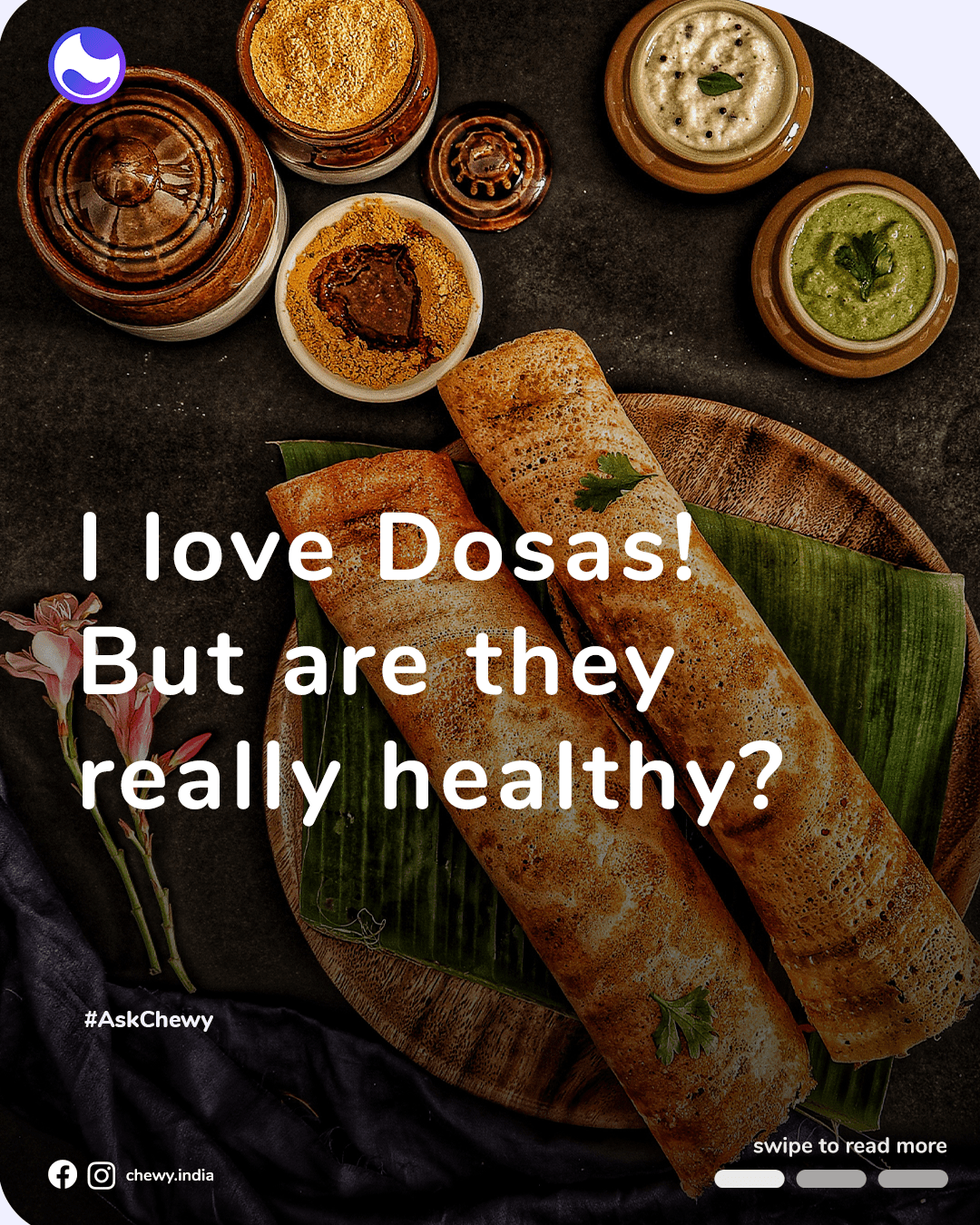
We didn’t build a food database. We built cultural intelligence.
Nutrition apps often fail in India because they speak in grams of quinoa.
Chewy speaks in chutneys, puran poli, fish curry, bhakri, and pongal.
Verified nutrition data.Regional tagging. Search by dish, not just ingredients.
What made it powerful wasn’t just the quantity.
It was recognition.
When the food you actually eat shows up correctly, it changes everything.
built for adoption
From install to retention, every touchpoint was engineered for clarity and intent. We focused on quality of interaction, not just quantity of reach. Content, product, and performance worked together as one continuous system.
The outcome was not just installs, but active, returning users who understood the product before using it.
10k+
App Installs
1.2M
Organic Social Views
3.8X
Average ROAS
62%
Week 1 Retention
function over flair
Chewy’s website was built as a bridge, not a billboard. It connected social discovery to app installs with clarity and speed. The layout was stripped down to essentials, removing anything that slowed the user. Visuals reflected the product. Copy spoke directly. Each section existed to move the visitor forward.
Every interaction was measured and intentional. Scroll depth was tied to message pacing. CTAs were placed where curiosity peaked. The goal was never to impress. It was to convert. The site acted as a checkpoint, guiding interested users into the app with minimal friction and maximum clarity.
Let’s collaborate.
Work with us to create solutions that drive real results for your business.